When a merchant drags a component onto a Page Designer page in edit mode, a mock component placeholder displays until the merchant configures the component attributes. Mock component placeholders are also used when a merchant creates a localized page based on another page or when a page doesn't render because it's missing attributes.
The mock component placeholder signals to the merchant that the component is not yet fully configured or has an error condition. The merchant can move the mock component and edit it like a regular component. The mock component displays only in edit mode.
A mock component uses the following values:
- The
nameof the component type as configured in its meta definition file. - The thumbnail image for the component type provided in a custom cartridge for Page Designer UI artifacts or, if no custom thumbnail image is provided, the generic Page Designer component thumbnail image.
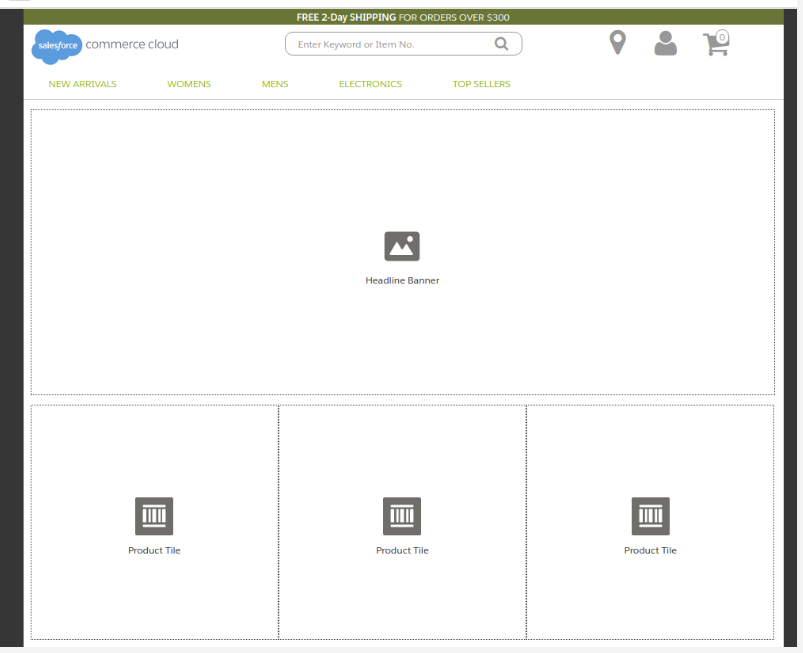
This example shows what a page looks like with four mock components, one for a headline banner and three for product tiles.
The HTML wrapper is always div. Mock components use the following two
classes:
- sfdc-component-mock
-
sfdc-component-<typeID>-mock, where
<typeID>is the ID of the component type. Component type ID
values include dots, for example,
assets.banner. When used in the class name, the dot is replaced with a hyphen, for example,assets-banner. For example, for a component type with IDassets.banner, the class is sfdc-component-assets-banner-mock.
To customize how a mock component placeholder displays, you can apply custom CSS to the
mock component class. For example, this CSS file, named
banner-mock.css, specifies that mock components using the class
sfdc-component-assets-banner-mock have a
background-color of lightblue.
         banner-mock.css
.sfdc-component-assets-banner-mock {
    background-color: lightblue;
}